[Editor’s note: As in the past, these panel recaps are based on notes typed during the session; all discussion is the nearest possible paraphrase, except for direct quotes which will be italicized.]
I’m going to do something I don’t believe I’ve ever done. I’m going to ask you to go elsewhere (two elsewheres, actually) to figure out what Scott McCloud said in his spotlight presentation on the occasion of 25 years of Understanding Comics. The first thing to do is to track down a copy of the Comic-Con 2018 Souvenir Book, because on pages 140-145, you’ll find the text of the presentation that McCloud did for the opening 10 minutes or so of his session. The essay didn’t offer enough room for pictures, though (I counted 18, if all the cover photos of foreign editions of UC are separate items), so he added a bunch more for his reading of the same material — about 200 in all. Guy knows how to keep things rolling along.
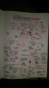
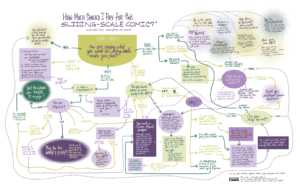
The second thing you need to do (or maybe the first, since the first may be really difficult) is to click on the image up top. Jason Alderman had been unaware of the McCloud session until about 10 minutes before I was going to walk up there; he decided on the fly he needed to go when I mentioned that McCloud would likely talk about his next book, which will be on visual communications (a topic near and dear to Alderman’s heart, and mine). He had his pens, but no suitable sketchbook for his famed sketchnoting. I offered the use of my notebook, which resulted in both the sketchnote above (which you should immediately embiggen) and the fact that I now have an Alderman original sketchnote (muwaa ha ha ha).
Let’s be clear — Alderman and I sat in the same session, in adjoining seats. We both set out to capture the same content in real time. He produced an image, I took down 1205 words, many correctly spelled. What we learned from this is that the old ratio is wrong — a picture is work approximately 1.2 thousand words (and probably 1000 words longer that by the time I finish). Go study that picture; examine it closely, and then you can come back here for some context.
_______________
Very well then: in the fall of 1991, during a rare tornado watch in Providence, Rhode Island, McCloud left the basement where he and his wife, Ivy, were huddling for safety when he heard the phone ring. The call was good — Kevin Eastman (of Ninja Turtles fame and lately fortune) was calling to say that his new publishing company, Tundra, was going to publish Understanding Comics.
To date, the book has outlived the publisher by approximately 24.8 years, and has become one of the most required pieces of reading on college campuses, with multiple disciplines using it to teach their stuff. It’s been translated into more than 20 languages. It has killed at least two publishers¹, and has a history intertwined with McCloud’s older daughter², as they were conceived, gestated, and birthed in parallel.
The book is a testament to McCloud’s obsession with how things work (more about that in a few moments), in that he couldn’t just make comics, he had to take them apart to see all that made them unique (particularly, during the Q&A, the fact that comics is the only artistic medium where past, present, and future exist together within human perception; music, movies, TV, plays, all the visual and performing arts depict now, a series of nows, but comics have those panels across time).
A professor who played doubles tennis with Will Eisner arranged an introduction, a job in production at DC happened to be near Books Kinokuniya in Manhattan a half decade before manga really made an impact in its first translations, and 15 years before it exploded into whole bookstore sections. Zot ran at the late Eclipse³ and started getting really good about the time he wanted to be spending time on UC4, meaning some of the most humanistic stories of that otherwise grimdark decade were done under duress.
Oh, yeah, and the first graphical web browser came out a few months after UC, which doesn’t mention computers once.
A slow start picked up momentum as the reorders came in, and kept coming; convention appearances became teaching gigs and seminars, symposia and workshops for corporations and academia. And still, it feels like unfinished business: for every project completed, ten more are rolling around in McCloud’s head, but so many readers (both those that read it back then, and those that have never known a world without it) are taking UC’s ideas out for a spin and creating their own takes on his theories.
Qs were chosen by Winter, with As from all three as appropriate; the first dealt with McCloud’s next book, which was the topic of the closing presentation, so we’ll hold discussion until then. Except to say that McCloud noted, The form of the book is a comic, but it doesn’t have “comics” in the name so it’s a big step for me.
A seemingly prosaic question got the best laugh of the hour: when was UC first used in a university setting? McCloud recalls that it was at Michigan State, but isn’t entirely sure of the timing. He once found himself humblebragging about the situation to Neil Gaiman: I remember talking to him, all these colleges are using my book, it’s a big deal and he said “I know, it’s like when all the women that line up at a reading to get their breasts signed” and I’m, “Yeah”. I’ve always found McCloud to be very modest about his accomplishments and the importance of his place in history, and I firmly believe that comes from the core of who he is; this little bit of perspective-setting surely didn’t hurt, though.
Asked about what he thought about the presentations of comics on mobile devices, and the tension between whole-page approaches and panel-to-panel scrolling, Ivy gave him a strict limit with a stern Five minutes. You know that last panel in UC with Sky in Ivy’s arms? She’s talking about how you just finished reading a couple hundred pages of his theories, but she has to listen to it all the time? Yeah, the presentation of comics on mobile interfaces falls into that category, leading McCloud to start with Thank you for the question, Pandora’s Box.
It’s a dilemma, in the literal sense — on the one hand people hate scrolling, but a lot of that comes from technical limitations that have been addressed. Panel-to-panel is more intuitive, making things like a little movie, but see above and how comics aren’t movies, movies are always now and you lose an essential part of comics in this way. But I don’t want to be the guy that insists on purity. Maybe it’s not technically comics by my definition, but are people reading it, are they enjoying it? Somebody invented a form that mutates my model, but it’s enduring.
Nevertheless, the form that accentuates the all-times nature of comics is essential; McCloud noted that Korean webcomics are all scrollers now (and they’ve brought the interface here, cf: Webtoons), and if that’s what they’re reading on phones, if you don’t take advantage, that’s a storytelling challenge (or possibly failure). He clearly had another 3-4 hours of rant in him, but stopped to get in one last question about his inspiration for The Sculptor:
[gesturing to Ivy] She’s my inspiration.
It’s a long-gelling story, one that a 25 year old McCloud started and a much older McCloud finished from a different place of technical, storytelling, and theoretical development. He likes that fact that the book got both a lot of love and a lot of hate, that nobody is indifferent. I achieved at least one of my goals which was to create narrative momentum — a lot of people told me they read a 500 page graphic novel in one sitting and that’s nuts.
And that left enough time for his second presentation, a preview of his next book on visual communications, on his absolute loathing of a plaque next to an elevator in a La Quinta motel in Tennessee and what he learned. It was called In Case Of Fire. This is the plaque, and he shared some of the interpretations of what this meant to people:
- In case of a Goliath attack, hide in a companion cube and get upvoted to safety
- Use chopsticks to remove cooked children from hot oven
- In case of 2 fires, ride the elevator heading to the larger fire
He mentioned the difficulty he had getting information from public websites that are supposed to talk about areas affected by Southern California wildfires, all down to poor formatting, and contrasted with the experiences of Sky (who is functionally blind) and how accessibility is either granted or denied by the choices made. There are no neutral visual decisions, he half-shouted: scale, rotation, hue, saturation, wording, contrast, font, placement, all of them matter. His realization is that it doesn’t matter if you’re blind, or have neurological or language issues, we all have cognitive limits and all of us are served or not by visual design.
He brought up Google results for what the words are meant to convey: In case of fire use stairs, and filtering out the gags, went to work. How does this read for somebody that scans images left to right? An awful lot of people are wandering towards the fire or have simply turned their backs to it, but even those that don’t could be just as easily read as In case of stairs, here’s some fire or Have a pleasant stroll in the vicinity of fire or Skip merrily down some stairs away from fire. Even word choice affects interpretation: use is a bad word in this context.
Anyway, he said, that’ll be like 20 pages of the book.
Lots of things are going to be like 20 pages of the book; we’ve talked about the literal years of research he’s done, about how 90% of what he’s digging into will probably never be shared, but which will give him to context to decide how to prune down and present the key ideas of the 10% that does make it in. He’s evangelical about the topic, noting that Culture has recognized the importance of each and every word, but denies the importance of each and every picture, not to mention how satisfying great visual communications design is — think about the wordless, nested, entirely clear (yet complex) instructions on an airplane emergency evacuation card.
Look for In Case Of Fire: The Elements Of Visual Communication (a title which he hopes invokes Strunk & White, but which will be nowhere near as slim5) in the next couple. Come to think of it, he never did say couple what.
Asked in the closing seconds if he got angry at fonts like Papyrus6 or Comic Sans7, McCloud replied, Comic Sans doesn’t make me angry, fonts don’t make me angry. I look, I say “Wrong”, I change the font. He contrasted the very haphazard nature of Roman characters to the very deliberate and nature of written Korean, concluding Fonts don’t make angry, but they very rarely satisfy me. And he made a recommendation, so you’ll have something to read while waiting for the next couple: I’m Comic Sans, Dammit, (which appears to actually be titled I’m Comic Sans, Asshole, but there were kids present), which ran in McSweeney’s. Kids, maybe hold off on reading it until you’re older.
And with that, the presentation ended with applause, and then he took another hour in the hallway, talking to everybody that had something they wanted to share with him. As a bonus, there was a guy dressed as Sean Connery in Zardoz adjusting his loincloth about 3 meters away, but I don’t think Scott ever noticed; whether it’s researching a book or answering an earnest fan’s question, he is a master of the monofocus.
_______________
¹ In a page full of small images captioned This is not a _____, the logo for Tundra is labeled This is not a publisher. By the time most purchasers of the first edition of 6000 copies read UC, that statement was true. When Denis Kitchen published the second edition through Kitchen Sink Press and had McCloud substitute the KSP logo for Tundra’s, the same thing quickly became true.
DC had their crack at it, with their “bullet” logo substituted in when they were the publisher; one might wonder if the curse shifted from the publisher as a whole to merely their cinematic universe offerings. It’s with HarperCollins now, and they wisely decided to let the DC logo stand.
² Sky, who wasn’t present with Ivy and younger daughter Winter, but had many stories about her shared. She didn’t exist when McCloud drew Ivy holding her on the last page of UC, but preceded the book into this world by approximately two weeks, meaning that last panel isn’t a lie.
³ McCloud’s really got a thing for defunct publishers
4 The “Earth stories”, still looked back upon by readers as the highlight of the series.
5 He’s mentioned a length of about 250 pages, but he also used that number the first time he told me he was working on The Sculptor, which came in at 496. Given all the research he’s doing, I will not be one bit surprised to see him go significantly long.
6 About which, let’s be real, there’s nothing wrong except rampant overuse.
7 About which everything is wrong.

