Thinking About Print
There are basically two things I find I don’t like about comics printed on paper. And both of them have “being printed” as the big cause.
The first is just ink. The facts are that ink on paper is a complicated problem (much much more complicated than it seems at first glance), and ink in general is produced through propriatary black arts by massive secret consortiums of chemical companies. This means that when you go to draw a comic that you want to print on paper, you have to spend some time thinking about what it’s going to look like after it’s printed. And so you think twice about that shade of orange, and you reconsider whether you’ve made those lines too thin, and you need to broaden them a bit. And as you spend more time doing this, you end up squeezing yourself into this kind of strangely distorted artistic sensibility, where you are shutting down avenues of expression before you’ve even read the street sign.
The second thing is really the same kind of thing. Because you’re thinking about getting this comic printed, you’re usually doing it for money. And so you’re thinking about the mass market point of view – or having to deal with distributors and agents that are doing that thinking for you. And so rather than throwing in a gratuitous piece (that happens to be really funny) about a guy laughing at a girl who’s just admitted to a deep trauma and then forcing her to give him a blowjob… you censor yourself. You say “Just because I think it’s funny, maybe it won’t sell well in Salt Lake City…”. And the more you focus on this, the more you lose track of making the best comic you can make.
The freedom from both of these weird mental distortions that working entirely for the web gives to artists is why I like web comics a lot better than paper comics. Sure, tentacle porn has it’s place too, but it’s not what really does it for me, you know?
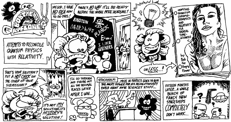
Stephen Notley manages to draw Bob the Angry Flower – which gets most of it’s distribution through print (certainly I first saw it in the City Paper… I think?) – without being trapped like this. Like Bob, he really doesn’t seem to consider what other people think before he writes. And he doesn’t seem to worry much about ink on paper, either, or generally the quality of his artwork.
So is it a web comic?
Who cares. It’s funny.
[…] If the line is overly sketchy, disconnected, or too light, it causes a sort of cognitive dissonance. Something deep down in our brains (probably something to do with hunting antelope on the open veldt) keys in on breaks from regular patterns. Sketchy, incomplete lines make your brain stop and go, “Wha?” If that’s what you wanted to accomplish within your story structure, great. Check out Alex Robinson’s Tricked for a good example of this; no, it’s not a webcomic. Read it anyway. But if the line isn’t intended to convey that “Wha?” moment, it just makes things tough on the eyes. Also to keep in mind: if you ever intend to print, you may find that lots of little lines, lines that are overly fine, or lines that are less than fully black aren’t going to reproduce well on paper (or at least be more expensive). You can save yourself a lot of reformat work later by finding a good line now. Let’s take a gander at two of Shaenon Garrity’s Narbonic sample strips one from 2000 (it’s the first strip from the second week “The Job Interview”), and one from 2005 (the first strip of “Battle for the Lost Diamond Mines of Brazil”). […]
By Fleen » Legibility II: Line on 01.03.06 4:35 pm
The above comments are owned by whoever posted them. The staff of Fleen are not responsible for them in any way.